Typography Best Practices for Web-Safe and Variable Fonts in WordPress
What you'll learn
 Web-Safe Font SelectionVariable Font IntegrationPerformance OptimizationAccessibility Best Practices
Introduction to Typography Customization in WordPress
Typography is a fundamental element of web design that often goes overlooked, yet it profoundly impacts user experience and readability. For WordPress users, understanding how to effectively customize typography is key to creating professional, accessible, and engaging websites. This article will delve into best practices for leveraging both web-safe fonts and the innovative capabilities of variable fonts, helping you make informed decisions for your WordPress site's visual identity and performance.
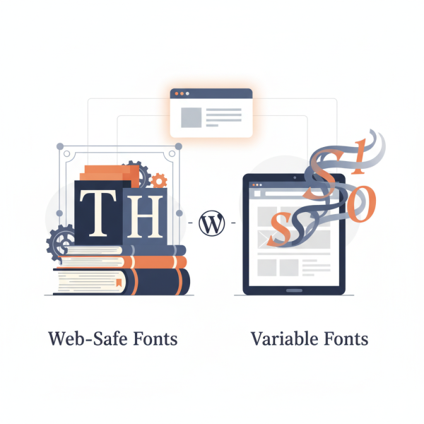
Understanding Web-Safe Fonts
Web-safe fonts are a collection of fonts that are pre-installed on virtually all operating systems. This means that when a user visits your website, their browser will display the specified font without needing to download it. This ensures consistent rendering across different devices and provides a reliable fallback if custom fonts fail to load.
While they might seem less exciting than custom font choices, web-safe fonts offer unparalleled stability and speed. They are an excellent foundational choice for body text or as reliable fallbacks, ensuring your content is always readable, even on slower connections or older browsers.
Common Web-Safe Fonts:
- Arial
- Verdana
- Helvetica
- Georgia
- Times New Roman
- Courier New
To implement web-safe fonts in WordPress, you can often select them directly within your theme's customization options or add simple CSS rules via the WordPress Customizer. For instance, you might set the primary body font to Arial with a generic 'sans-serif' fallback.
Embracing Variable Fonts
Variable fonts represent a significant leap forward in typography, allowing a single font file to contain an entire range of design variations. Instead of loading multiple font files for different weights (light, regular, bold) or styles (italic), a variable font can deliver all these variations, and even more nuanced adjustments like width or slant, from one compact file. This innovation dramatically reduces page load times and offers unprecedented design flexibility.
The power of variable fonts lies in their ability to provide fine-grained control over typographic styles. Designers can animate font properties, create responsive typography that adapts to screen sizes, and achieve unique visual expressions without the performance penalty of loading numerous static font files. While browser support is strong, it's always wise to include appropriate fallbacks for older browsers.
Advantages of Variable Fonts:
- Reduced File Size: One file replaces many, leading to faster loading.
- Enhanced Design Flexibility: Smooth transitions between weights, widths, and other axes.
- Improved Responsiveness: Typography can fluidly adapt to different screen sizes and orientations.
- Future-Proofing: A modern approach to web typography.
Finding and using variable fonts involves selecting a font family that supports this technology, such as those found on Google Fonts (which increasingly offers variable options) or specialized font foundries. Integration into WordPress often involves enqueueing the font file correctly via your theme's functions.php or using a plugin that supports custom font uploads.
Best Practices for Typography Customization in WordPress
Regardless of whether you choose web-safe or variable fonts, adopting best practices ensures your typography enhances your WordPress site.
Performance and Loading: Always prioritize loading fonts efficiently. For variable fonts, this means leveraging their single-file advantage. For web-safe fonts, it means knowing they require no loading at all. If using external custom fonts (like Google Fonts or Adobe Fonts), ensure they are loaded asynchronously or preloaded to prevent render-blocking issues. Minimize the number of different font families used on your site to keep things lightweight.
Accessibility and Readability: Ensure your font choices promote readability. This involves selecting appropriate font sizes for headings and body text, maintaining sufficient line height, and ensuring strong color contrast between text and its background. Test your typography on various devices and screen sizes to confirm it remains legible for all users, including those with visual impairments.
Consistency and Hierarchy: Establish a clear typographic hierarchy using different font sizes, weights, and styles for headings, subheadings, and body text. This guides users through your content and improves comprehension. Consistency across your site strengthens your brand identity and provides a professional look and feel.
Testing Across Devices: Always test your font choices and styling across different browsers (Chrome, Firefox, Safari, Edge) and devices (desktops, tablets, mobile phones). What looks good on one screen might be difficult to read on another. The WordPress Customizer's responsive previews are a good starting point, but physical device testing is invaluable.
Implementing Fonts in WordPress: Practical Tips
WordPress offers several ways to manage your site's typography. For basic changes, many themes integrate font options directly into the WordPress Customizer, allowing you to select from a list of fonts and adjust sizes, weights, and line heights with live previews. This is the simplest method for most users.
For more advanced control or to integrate variable fonts, you might need to utilize custom CSS. The Customizer has a 'Additional CSS' section where you can write your own rules to target specific elements. For example, you could define a `@font-face` rule to load a variable font and then apply it to your body or heading elements.
The Block Editor (Gutenberg) also provides typography controls for individual blocks, allowing you to fine-tune font sizes, appearances, and line heights directly within your content. This offers granular control without needing to write code.
Finally, various WordPress plugins exist to simplify font management. Plugins designed for Google Fonts or those allowing custom font uploads can streamline the process of adding and managing more complex font systems, including variable fonts, without requiring extensive coding knowledge.
Summary
Customizing your WordPress site's typography is a powerful way to enhance its appearance and user experience. By strategically employing web-safe fonts for broad compatibility and leveraging the efficiency and flexibility of variable fonts, you can achieve sophisticated designs without sacrificing performance. Always prioritize readability, accessibility, and consistency, and thoroughly test your font choices across different devices and browsers. With these best practices, you'll be well-equipped to create a visually appealing and highly functional WordPress site.
Comprehension questions
 What are web-safe fonts and why are they important for WordPress users?How do variable fonts differ from traditional static fonts, and what are their key advantages?List three best practices for typography customization in WordPress sites.What are some practical ways WordPress users can implement and manage fonts on their websites?