Sophisticated Page Designs with Groups and Columns
- -->> 3. Sophisticated Page Designs with Groups and Columns
What you'll learn
 Group Block FunctionalityColumn Layout StrategiesNested Block ApplicationsResponsive Design Principles
Crafting sophisticated designs efficiently and effectively requires a deep understanding of powerful layout tools. Among the most versatile tools available are the Group block and the Columns block, especially when used in combination and with a focus on responsiveness. This article will guide you through the process of leveraging these blocks to construct complex and adaptable page designs, transforming your approach to layout creation and enabling you to build visually rich and highly functional web pages.
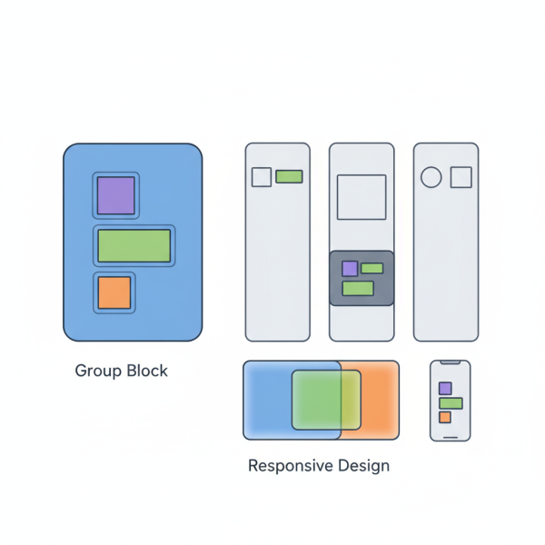
Understanding the Group Block
The Group block is fundamental to organizing content within a layout. It acts as a container, allowing you to combine multiple blocks into a single unit. This seemingly simple functionality is incredibly powerful because it enables you to apply settings, such as background colors, padding, or block spacing, to an entire collection of blocks simultaneously.
Think of the Group block as a virtual box. You can put headings, paragraphs, images, and even other Group blocks inside it. This container helps maintain visual coherence and simplifies management, especially when you need to move or duplicate sections of your page.
Key benefits of using the Group block include:
- Content Organization: Logically groups related content.
- Styling Consistency: Apply styles to a whole section.
- Enhanced Control: Easier to manage and manipulate larger content chunks.
- Improved Accessibility: Helps structure content semantically.
Mastering the Columns Block
While the Group block helps with vertical segmentation, the Columns block is essential for horizontal arrangements. It allows you to divide a section of your page into multiple vertical columns, perfect for showcasing content side-by-side. You can choose the number of columns and even adjust their individual widths to create diverse grid-like structures.
The real power of columns emerges when you consider their responsive capabilities. Modern column blocks are designed to adapt automatically to different screen sizes. For instance, three columns on a desktop might stack vertically into a single column on a mobile device, ensuring readability and usability across all platforms. This inherent responsiveness saves significant effort in creating separate mobile layouts.
Nesting for Advanced Layouts
The true complexity and flexibility in page design come from nesting these blocks. Nesting means placing a Group block inside a Column block, or a Column block inside a Group block, or even a Group block inside another Group block. This hierarchical structure allows for incredibly intricate and specific design patterns.
Consider a scenario where you want a two-column layout, but within one of those columns, you need a section with a distinct background color and padding, containing a heading and two paragraphs. You would achieve this by placing a Group block inside that specific column. The Group block would then hold the heading and paragraphs, and its settings would apply only to its contents within that column.
Conversely, you might have a full-width section (a Group block) and within that section, you want to introduce a three-column layout for a feature showcase. Here, a Columns block would be nested inside the outer Group block. This layering enables fine-grained control over every aspect of your layout.
Responsive Design Considerations
Building complex layouts necessitates a strong focus on responsiveness. While Columns blocks offer inherent adaptability, careful planning with Group blocks further enhances this. When you nest blocks, consider how each layer will behave on different devices.
For instance, a Group block might have specific padding settings that look great on a desktop but are too generous on a mobile screen. Many modern block editors provide options to adjust these settings per device, or you can rely on the default responsive behaviors of the blocks. Always preview your designs on various screen sizes during the development process to catch potential layout issues early.
Key responsive practices:
- Test Regularly: Constantly check layouts on desktop, tablet, and mobile.
- Prioritize Content Flow: Ensure content remains readable when stacked or reordered.
- Use Flexible Units: Opt for percentages or fr units for column widths when available, promoting fluid layouts.
- Consider Block Spacing: Adjust margins and padding to prevent content from looking cramped on smaller screens.
Best Practices for Layout Construction
To master complex layouts, adopt a systematic approach. Start with the broadest structural elements and gradually refine the details.
- Outline Your Structure: Before touching the editor, sketch out your desired layout. Identify main sections, sidebars, and content areas.
- Start Broad, Then Detail: Begin with outer Group blocks and primary Column divisions. Then, work inwards, adding nested groups and individual content blocks.
- Label Blocks (if available): If your editor supports block labeling, use it. This makes navigating complex nested structures much easier.
- Iterate and Refine: Layout design is rarely perfect on the first try. Continuously adjust spacing, alignment, and responsiveness.
- Maintain Simplicity Where Possible: While the goal is complexity, avoid over-nesting or using blocks unnecessarily. Strive for the simplest structure that achieves the desired design.
Summary
This article explored the power of the Group and Columns blocks as foundational tools for constructing sophisticated and responsive page designs. We delved into how the Group block serves as an essential container for organizing and styling sections of content, while the Columns block facilitates horizontal content arrangement and inherent responsiveness. The synergy of nesting these blocks was highlighted as the key to unlocking advanced layout possibilities, allowing for intricate structural control. Finally, we covered crucial responsive design considerations and outlined best practices to ensure your complex layouts are both beautiful and functional across all devices. Mastering these techniques will significantly elevate your web design capabilities.
Comprehension questions
 What is the primary function of the Group block in page layout?How does the Columns block contribute to horizontal content arrangement and responsiveness?Explain the concept of nesting blocks and why it is crucial for advanced layouts.What are some key responsive design practices to consider when building complex layouts?
Community Poll
Next Lesson

Course Contents : WordPress Gutenberg: Advanced Block Editor Techniques
- >> 3.
 Sophisticated Page Designs with Groups and Columns


