
Image Optimization and Scaling
- -->> 24. Image Optimization and Scaling
What you'll learn
 Image File FormatsCompression TechniquesResponsive Image SizingLazy Loading Implementation
The benefits of rich visuals within your WordPress website come with a critical challenge: ensuring these assets do not impede website performance. Image optimization and scaling are not merely technical considerations; they are crucial strategies for delivering fast-loading, visually crisp, and engaging web experiences across all devices. Neglecting these aspects can lead to slow page loads, frustrated users, and ultimately, missed opportunities.
Why Image Optimization Matters for Web Performance
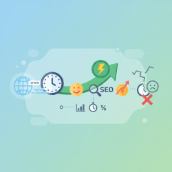
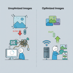
The speed at which a webpage loads significantly impacts user engagement and satisfaction. Large, unoptimized images are often the biggest culprits behind sluggish websites, directly contributing to high bounce rates and poor conversion metrics. Users expect instant gratification, and even a few seconds of delay can deter them from staying on a site.
Beyond user experience, search engine optimization (SEO) is heavily influenced by page speed. Search engines like Google prioritize fast-loading websites, rewarding them with better rankings. This means that a website with optimized images is more likely to appear higher in search results, driving more organic traffic.
Optimized images also lead to reduced bandwidth consumption. For both the website owner and the user, smaller file sizes mean less data transfer. This is particularly beneficial for users on mobile data plans or in areas with slower internet connections, ensuring accessibility and a smoother experience for a wider audience.
Ultimately, investing in image optimization translates into a more professional and polished online presence. It demonstrates attention to detail and a commitment to providing the best possible experience for visitors, fostering trust and encouraging repeat visits.
Core Principles of Effective Image Optimization
Effective image optimization involves a multifaceted approach, combining various techniques to achieve the best balance between quality and file size.
Choosing the Right File Format
Selecting the appropriate image format is the foundational step. Each format serves a different purpose:
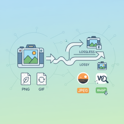
- JPEG (JPG): Ideal for photographs and complex images with many colors, as it uses lossy compression to reduce file size significantly while maintaining reasonable visual quality.
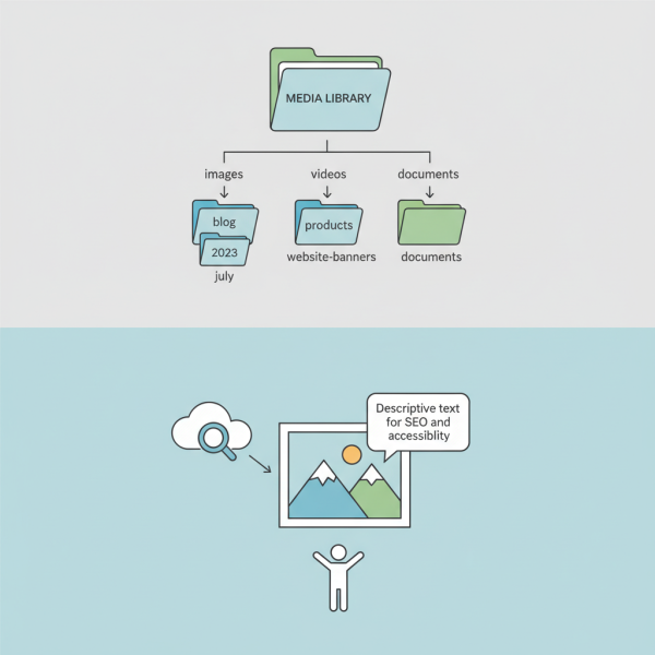
- PNG (Portable Network Graphics): Best for images requiring transparency (like logos) or images with sharp lines and fewer colors (like illustrations or screenshots). PNG offers lossless compression, preserving image quality perfectly.
- WebP: A modern format developed by Google, offering superior lossy and lossless compression for both photographic and graphic images. It typically provides significantly smaller file sizes than JPEG or PNG while maintaining comparable quality.
- AVIF: The newest contender, offering even better compression ratios than WebP, especially for high-quality images. Browser support is growing, and it's an excellent choice for future-proofing your image strategy.
Intelligent Compression Techniques
Compression is about reducing file size. There are two main types:
- Lossy Compression: Permanently removes some image data to achieve smaller file sizes. JPEG is a lossy format. While it reduces quality, the goal is to make these reductions imperceptible to the human eye. Adjusting the compression level allows you to find the sweet spot.
- Lossless Compression: Reduces file size without discarding any data. PNG uses lossless compression. While the file size reduction is less dramatic than lossy methods, it ensures pixel-perfect fidelity.
Tools like TinyPNG, Squoosh, and image optimization plugins for content management systems can automate and simplify the compression process.
Responsive Image Sizing and Scaling
Images must display correctly and efficiently across a multitude of screen sizes and resolutions. This is where responsive image techniques become vital. Instead of serving one large image to all devices, responsive images deliver appropriately sized versions.
HTML attributes like srcset and sizes are powerful for this purpose. srcset allows you to define a list of different image files along with their intrinsic widths or pixel densities, letting the browser choose the most suitable image. sizes provides hints to the browser about the displayed width of the image, helping it make the best selection from srcset.
For simple scenarios, CSS properties like max-width: 100%; and height: auto; ensure images scale down within their containers without overflowing and maintain their aspect ratio.
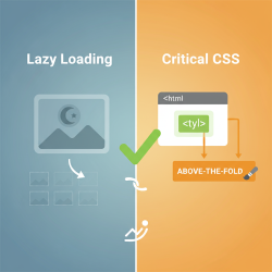
Implementing Lazy Loading
Lazy loading defers the loading of images that are not immediately visible in the user's viewport. Images only load when the user scrolls down and they come into view. This dramatically improves initial page load times, especially for content-heavy pages with many images below the fold.
Modern browsers increasingly support native lazy loading via the loading="lazy" attribute on
Advanced Strategies for Image Delivery
Server-Side Dynamic Image Generation
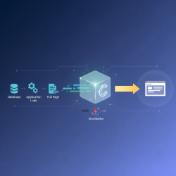
For highly dynamic websites, server-side solutions can generate and serve images in real-time based on specific user requests or device capabilities. This ensures optimal image delivery without manual preparation of every possible variation. Content Delivery Networks (CDNs) often integrate these capabilities, resizing and optimizing images on the fly from edge servers closer to the user.
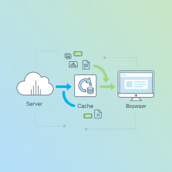
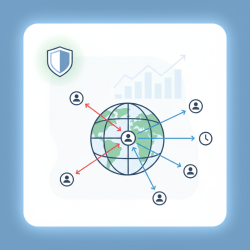
Leveraging Content Delivery Networks (CDNs)
CDNs are invaluable for image delivery. They cache optimized image versions on servers globally, reducing latency by delivering content from a server geographically closer to the user. Many CDNs also offer built-in image optimization features, including format conversion, compression, and responsive scaling, automating much of the optimization workflow.
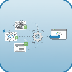
Tools and Workflow Considerations
Integrating image optimization into your development workflow is key to consistency and efficiency.
- Image Editors: Traditional tools like Adobe Photoshop or GIMP provide granular control for initial image preparation, cropping, and saving in desired formats.
- Online Optimizers: Websites such as TinyPNG, Compressor.io, and Squoosh offer easy-to-use interfaces for quick compression and format conversion.
- Build Tools & Plugins: For developers, tools like Webpack or Gulp have plugins (e.g.,
imagemin,responsive-loader) that can automate optimization during the build process, ensuring all images are optimized before deployment. - CMS Plugins: Platforms like WordPress offer numerous plugins that automatically optimize images upon upload, often converting them to WebP and implementing lazy loading.
Testing and Continuous Improvement
Optimization is an ongoing process. Regularly testing your website's performance is crucial to ensure that image optimizations are effective and to identify any new areas for improvement.
Browser developer tools offer network tabs to inspect individual image load times and file sizes. Tools like Google Lighthouse, GTmetrix, and PageSpeed Insights provide comprehensive reports on overall page performance, highlighting image-related issues and suggesting specific optimizations. Regular audits help maintain peak performance as your website evolves.
Summary
Image optimization and scaling are indispensable practices for modern web development, directly influencing website performance, user experience, and search engine visibility. By strategically choosing appropriate file formats, applying intelligent compression, implementing responsive image techniques, and leveraging lazy loading, developers can drastically reduce image file sizes without compromising visual quality. Utilizing modern tools, integrating CDNs, and continuously monitoring performance ensure an agile and effective image delivery strategy. Prioritizing these techniques is vital for creating fast, accessible, and engaging web content in a competitive digital landscape.
Comprehension questions
 What are the primary benefits of implementing image optimization and scaling techniques on a website?Compare and contrast lossy and lossless compression, providing examples of when each is most appropriate.How do HTML attributes like srcset and sizes contribute to responsive image delivery?Explain the concept of lazy loading and its impact on initial page load times.
Community Poll
Next Lesson
Course Contents : Website Speed Performance Optimization
- >> 24.
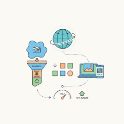 Image Optimization and Scaling


