
Advanced Web Layouts with Structural Blocks
- -->> 18. Advanced Web Layouts with Structural Blocks
What you'll learn
 Structural Block FundamentalsNesting for Complex LayoutsResponsive Design with BlocksBest Practices for Layout Building
Modern web design frequently demands layouts that are both visually engaging and highly functional. Gone are the days when simple single-column or rigid grid layouts sufficed for every content need. Today, designers and developers are empowered to construct intricate, multi-column designs that dynamically adapt to various screen sizes. This evolution is largely driven by the sophisticated use of structural blocks, specifically columns and groups, which provide an intuitive yet powerful framework for building complex web designs with unparalleled flexibility and responsiveness. Understanding how to effectively combine and nest these blocks is crucial for anyone looking to push the boundaries of conventional web page structures.
Understanding Structural Blocks: Columns and Groups
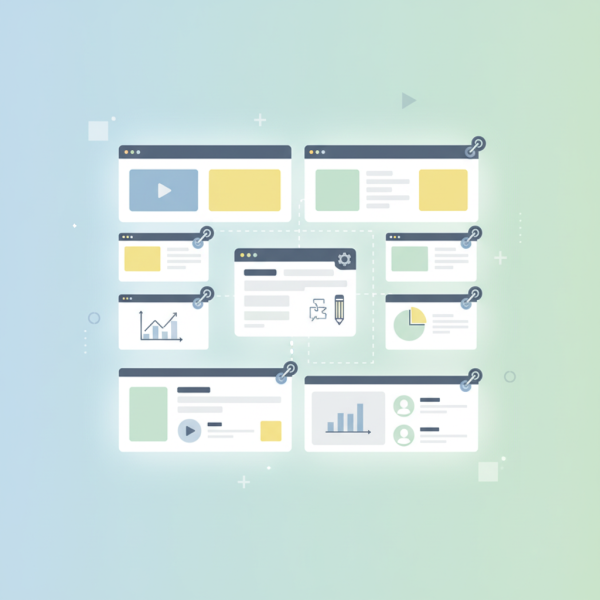
At the core of advanced layout building are two fundamental structural blocks: columns and groups. While seemingly straightforward, their combined utility unlocks a vast array of design possibilities. Columns are essentially containers that allow content to be organized horizontally across a page. They divide the available width into multiple vertical segments, enabling side-by-side content presentation.
Groups, on the other hand, are more general-purpose containers. They act as wrappers for collections of other blocks, including paragraphs, images, buttons, and even other columns or groups. The primary benefit of a group is its ability to apply consistent styling, background colors, padding, margins, or even layout properties to an entire section of content, regardless of the individual blocks it contains. They provide a semantic way to section off different parts of your page, improving both organization and maintainability.
When used in conjunction, columns define the horizontal distribution, while groups organize and style larger, coherent sections of content, often spanning multiple columns or containing complex arrangements within a single column. This synergy forms the foundation for truly advanced web layouts.
The Power of Nested Layouts
The true magic of structural blocks becomes apparent when you begin to nest them. Nesting involves placing one type of block inside another, allowing for increasingly sophisticated and layered designs. Imagine a main group that contains a three-column layout. Within one of those columns, you might place another group, which itself contains a two-column layout. This creates a highly specific internal arrangement without disrupting the broader page structure.
For instance, you could have a main content area (a group) with a two-column structure. The left column might contain a simple text block. The right column, however, could house another group. This inner group might then be styled with a distinct background and contain a headline and a call-to-action button. Below this inner group, but still within the right main column, you could place a gallery block. This layering allows for meticulous control over content placement, visual hierarchy, and overall aesthetic.
Nesting enables the creation of magazine-style layouts, complex product displays, multi-faceted landing pages, and interactive dashboards. It ensures that related content stays together logically, even when presented in a visually distinct manner, enhancing both user experience and content readability across various device types.
Achieving Responsiveness with Blocks
One of the most critical aspects of modern web design is responsiveness – the ability of a website to adapt seamlessly to different screen sizes, from large desktop monitors to small mobile phones. Structural blocks, particularly columns and groups, are designed with responsiveness in mind. Modern block editors and underlying CSS frameworks handle much of the heavy lifting.
When you define a multi-column layout, these systems typically have built-in mechanisms to adjust the column behavior at different breakpoints. For example, a three-column layout on a desktop might automatically stack into a single-column layout on a mobile device, ensuring readability and usability without requiring manual intervention from the designer for every single element. Groups also contribute by allowing developers to define responsive styling that changes based on screen width, such as adjusting padding or font sizes for contained elements.
This inherent responsiveness greatly simplifies the development process, allowing designers to focus on content arrangement and visual appeal, knowing that the structural blocks will intelligently reconfigure themselves for optimal viewing on any device. It's a fundamental shift from fixed-width designs to fluid, adaptive experiences.
Best Practices for Advanced Layouts
To truly leverage the power of columns and groups for complex designs, consider these best practices:
- Plan Your Layout Visually: Before diving into a block editor, sketch out your desired layout. Understand which sections need to be grouped, how many columns each group requires, and the hierarchy of content.
- Maintain Semantic Structure: Use groups and columns for their intended structural purpose. Avoid using them purely for styling when a simpler block or CSS class would suffice. A logical structure aids accessibility and future maintenance.
- Prioritize Accessibility: Ensure your complex layouts remain accessible to all users. Pay attention to tab order, color contrast, and ensure content reflows logically on smaller screens.
- Optimize for Performance: While nesting is powerful, excessive and unnecessarily deep nesting can sometimes lead to increased DOM complexity and slower page rendering. Strive for efficient block usage.
- Test Across Devices: Always preview and test your layouts on various screen sizes and orientations to confirm that the responsiveness is working as intended and the user experience remains consistent.
- Use Consistent Spacing: Leverage the spacing controls offered by groups and columns to maintain visual harmony and readability throughout your multi-column designs.
Tools and Platforms for Block-Based Design
The rise of structural blocks has been greatly facilitated by modern content management systems and website builders. Platforms like WordPress, with its Gutenberg editor, are prime examples. Gutenberg is built entirely around the concept of blocks, offering dedicated "Columns" and "Group" blocks that users can drag, drop, and configure directly within the editor interface. This visual approach democratizes advanced layout building, making it accessible even to users without extensive coding knowledge.
Other website builders and design tools have adopted similar block-based philosophies, recognizing the efficiency and flexibility they provide. These tools often come with pre-designed block patterns or templates that demonstrate effective use of columns and groups, offering starting points for complex layouts and accelerating the design process. They abstract away the underlying HTML and CSS, allowing a focus on content and visual presentation.
Summary
Building advanced layouts with structural blocks like columns and groups represents a significant leap forward in web design. By providing powerful containers for organizing and presenting content, these blocks enable designers to move beyond rigid templates to create complex, multi-column web designs that are both visually appealing and inherently responsive. The ability to nest these blocks allows for incredible detail and customizability, while adherence to best practices ensures maintainability and optimal performance. Mastering columns and groups is essential for anyone aiming to craft modern, adaptable, and engaging web experiences that cater to a diverse range of devices and user needs.
Comprehension questions
 How does nesting structural blocks contribute to creating more sophisticated and layered web designs?Explain how structural blocks inherently support responsive web design across various screen sizes.List three best practices for effectively using columns and groups to build advanced web layouts.
Community Poll
Next Lesson
Course Contents : Website Speed Performance Optimization
- >> 18.
 Advanced Web Layouts with Structural Blocks


