Responsive Images and Modern Formats
- -->> 7. Responsive Images and Modern Formats
What you'll learn
 Responsive Image TechniquesNext-Gen Image FormatsWeb Performance OptimizationImage Delivery Strategies
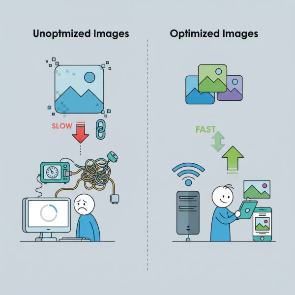
Images are fundamental to engaging web experiences, yet they often represent the largest portion of a webpage's total file size. Unoptimized images can significantly degrade website performance, leading to slower load times, increased bounce rates, and a frustrating user experience. In today's diverse device landscape, delivering appropriate image sizes and leveraging cutting-edge compression technologies are no longer optional but essential. This article delves into the strategies for implementing responsive images and harnessing the power of modern formats like WebP and AVIF to achieve optimal visual delivery and superior web performance.
The Challenge of Images on the Web
The digital world is characterized by an immense variety of screen sizes and resolutions, from compact smartphone displays to expansive 4K monitors. Serving a single, high-resolution image to all devices is inefficient; smaller screens waste bandwidth downloading unnecessary data, while larger screens might display pixelated visuals if the image is too small. This disparity creates a significant challenge for web developers striving for both visual fidelity and speed.
Large image file sizes directly impact page load times. Every kilobyte added to a page contributes to a longer wait for the user, especially on slower network connections. This performance bottleneck can critically affect user engagement, search engine rankings, and ultimately, a website's overall success. Finding the right balance between stunning image quality and minimal file size is a perpetual optimization task.
Responsive Images Explained
Responsive images are a set of techniques that allow browsers to choose the most appropriate image source based on the user's device characteristics, such as screen size, resolution, and viewport dimensions. Instead of serving a single, static image, responsive images provide multiple versions of the same image, each optimized for different contexts.
The primary tools for implementing responsive images within HTML are the srcset and sizes attributes for the
The srcset attribute specifies a list of image files along with their intrinsic widths or pixel densities. For example, srcset="image-small.jpg 480w, image-medium.jpg 800w, image-large.jpg 1200w". This tells the browser that image-small.jpg is 480 pixels wide, image-medium.jpg is 800 pixels wide, and so on.
The sizes attribute works in conjunction with srcset, informing the browser about how much space the image will occupy on the screen at different viewport widths. For instance, sizes="(max-width: 600px) 100vw, (max-width: 1200px) 50vw, 33vw" indicates that on screens up to 600 pixels wide, the image will take 100% of the viewport width. Between 601px and 1200px, it will take 50%, and above 1200px, it will take 33%.
The elements, each with its own media attribute (similar to CSS media queries) and srcset, followed by a fallback
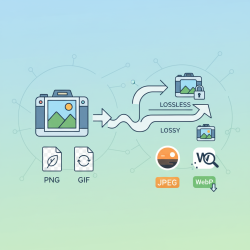
Embracing Next-Gen Image Formats
Beyond serving appropriately sized images, significant performance gains can be achieved by utilizing modern image formats. These formats employ advanced compression algorithms that deliver comparable or superior visual quality at substantially smaller file sizes than traditional JPEG and PNG formats. The two leading contenders in this space are WebP and AVIF.
WebP, developed by Google, has gained widespread adoption and offers excellent lossless and lossy compression. It typically achieves 25-34% smaller file sizes compared to JPEG for lossy images and 26% smaller than PNG for lossless images, all while maintaining perceptual quality. Its broad browser support makes it a practical choice for most web projects today.
AVIF, a newer format based on the AV1 video codec, pushes the boundaries of image compression even further. It often delivers 30-50% smaller file sizes than WebP, and up to 50-70% smaller than JPEG, for the same visual quality. While AVIF offers superior compression and support for advanced features like HDR, its browser support is still growing, though major browsers like Chrome, Firefox, and Safari now support it.
Adopting these formats requires a strategy that caters to both modern and legacy browsers. This is where the
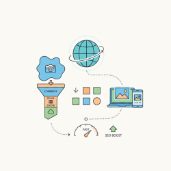
Implementation Strategies for Optimal Delivery
Combining responsive image techniques with next-gen formats creates a powerful duo for optimal image delivery. The
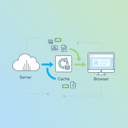
Beyond client-side implementation, server-side optimizations play a crucial role. Content Delivery Networks (CDNs) with image optimization capabilities can automatically resize, compress, and convert images to appropriate formats based on browser support and device detection. Services like Cloudinary, Imgix, or even custom serverless functions can handle this complex task efficiently, delivering optimized images on the fly.
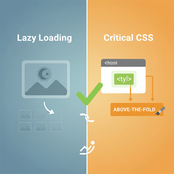
Finally, consider implementing lazy loading for images that are not immediately visible in the viewport. This defers the loading of off-screen images until the user scrolls near them, reducing initial page load time and conserving bandwidth. Modern browsers offer native lazy loading with the loading="lazy" attribute, providing a simple yet effective optimization.
Summary
Optimizing images is a critical component of building high-performing and user-friendly websites. By strategically implementing responsive image techniques, developers can ensure that users receive images perfectly scaled and rendered for their specific devices, eliminating unnecessary data transfer. Furthermore, embracing next-generation image formats like WebP and AVIF offers substantial file size reductions without compromising visual quality, leading to significantly faster load times and an improved user experience. Combining these strategies through HTML elements like picture and leveraging server-side solutions ensures comprehensive image optimization, fostering a more efficient and engaging web environment for everyone.
Comprehension questions
 What are two primary challenges images pose for web performance on diverse devices?Explain the primary roles of the `srcset` and `sizes` attributes in implementing responsive images.Name two next-generation image formats discussed in the article and highlight their main advantage over traditional formats.How does the `picture` element facilitate the combined use of responsive images and modern formats with fallback options?
Review Quiz
Next Lesson
Course Contents : Website Speed Performance Optimization
- >> 7.
 Responsive Images and Modern Formats


